


I n order to make informed decisions, you must have good information. The type of information you will gather depends on the research you are doing. There are many methods of data collection, a few of which are:
After collecting data, you will need methods for analysis. Analysis serves two purposes: 1) to summarize your information so you know what you have and 2) to display your information for others to see. Some methods for data analysis are:
Pareto's rule states, "eighty percent of your troubles will come from twenty percent of your problems." It is known as the 80/20 rule. Using this rule allows you to identify and concentrate on the most important problems first.
The first step is to look for the key issues and separate them from the trivial ones. Then identify which issues are the most important. That can be done by collecting data and displaying it in a histogram showing each characteristic in descending order of magnitude. Data should be displayed with the high value items on the left side of the chart. This type of histogram is known as a Pareto chart.
For example, say your company is having trouble delivering shipments to customers in a timely fashion. Through a brainstorming session a large list of possible causes could be generated. Once the list is pared down to the most important reasons, you may have something like this:
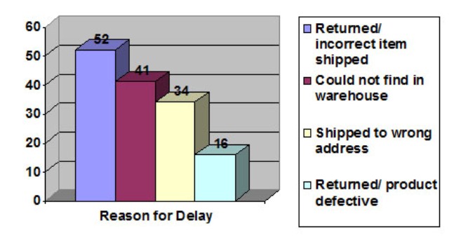 |
One axis of the chart would display these segments, and the other axis would display the frequency. The chart shows the most important problem on the left. You should begin by first improving this problem. After that, another assessment would need to be made to determine if "could not find in the warehouse" was still the second priority.
Time plots simply show how some factor has changed over time. The chart would display time over one axis and the occurrence of the factor along the other axis. The importance of the chart is to see if there is actually a change over time.
For example, say your company implemented actions to decrease employee absences, which had become a problem possibly due to low moral. The chart would show the absenteeism and then plot the absences over time. At various points along the chart, comments could be inserted to show what changes had occurred. If absenteeism decreased, then the changes affected the change.
That information you gather might look like this:
| Absences: | Week 1: 27 | Week 5: 17 |
| Week 2: 29 | Week 6: 18 | |
| Week 3: 28 | Week 7: 16 | |
| Week 4: 19 | Week 8: 14 | |
| Week 9: 12 | ||
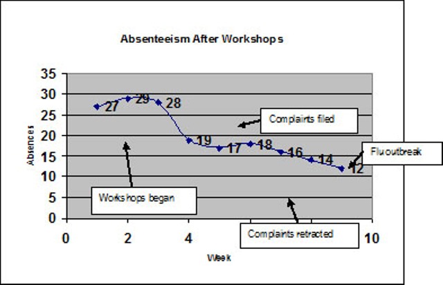 |
From the data above, it appears the workshops were helping the absenteeism problem until the flu outbreak. The company would need to continue monitoring the data to determine if there was a long-term affect.
Every team should ask these six questions during analysis:
Next section: Project Management
| Team Building Skills Home Page |
Velda Arnaud,
Ph.D.
Executive Director
Lead, Educate, Serve Society
leadeducateserve@gmail.com
Last updated 10/4/14 (va)
Copyright 2004-present